What is a responsive website?
A responsive website is a website which responds to the device its being viewed on.
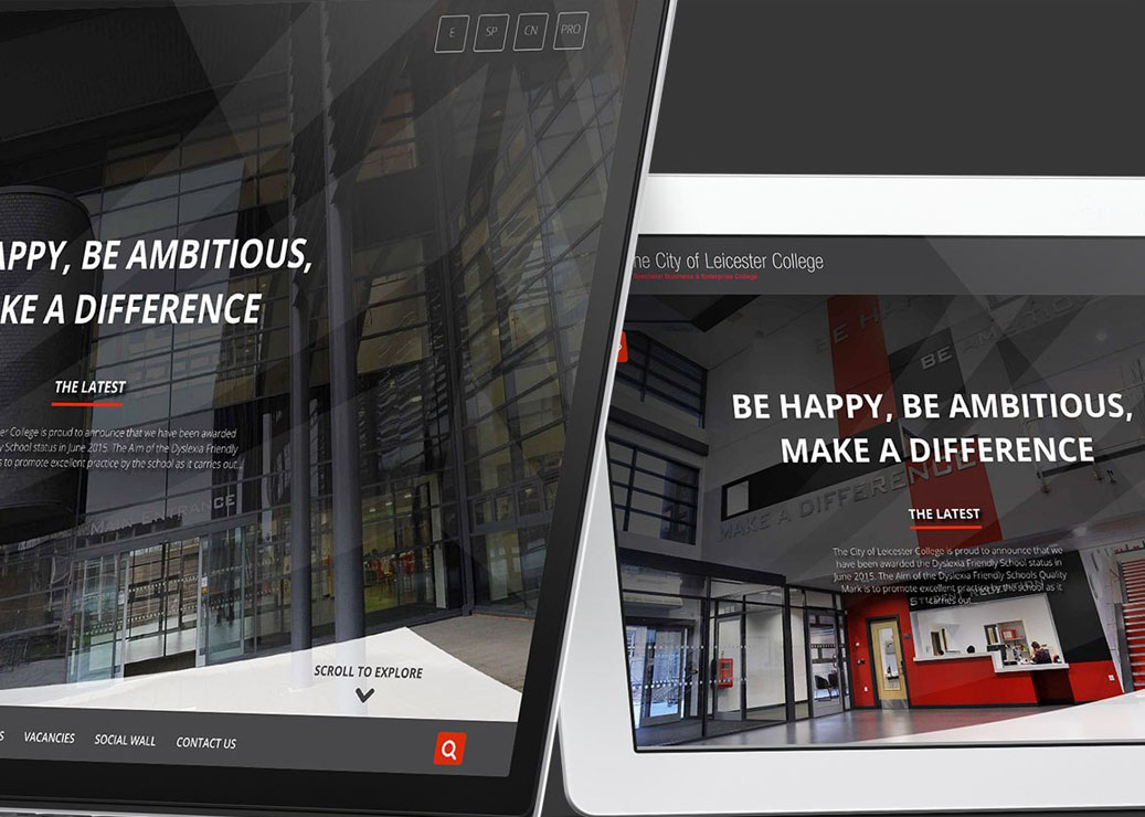
With the ever increasing spectrum of mobile devices available to consumers, responsive development allows us to create websites which dynamically react – when a person clicks on your website link from desktop, mobile or tablet the website immediately detects the resolution it is being viewed from and ‘responds’ accordingly to provide the best experience for that device.
Negating the need to pinch squeeze or resize – immediately improving the experience of your website on your potential or existing customer and increasing satisfaction with your brand.
Why responsive website development?
The core reasons for adopting a responsive website are spread across the different aspects we believe make a website deliver on its objectives – usability, content, search engine visibility and conversion optimisation.
This means that with one website (and one content management system) you can deliver a different usability mechanisms to website visitors. For example, on a widescreen monitor we might choose to have wide screen photography and a mega menu yet when the same website scales down to an iPhone it may incorporate a hamburger menu and use gesture control.
With responsive development we can also ensure that no content is compromised from desktop to mobile, giving your customers a complete view of your website information no matter how they’re accessing your website.
That said, responsive development also gives us the flexibility to deliver prioritised content from one screen resolution to another – allowing us to merchandise content better across devices – with the ultimate aim of increasing website conversions.
The major Google update of 2015 – affectionately labeled Mobilegeddon by industry experts – saw Google add responsive website development to its ever expanding list of algorithm changes.
The update sees responsive websites favoured by the leading search engine; over standard desktop websites and also against separate mobile versions.
The arguments for responsive design in terms of design, usability, content and search visibility stack up.
Thankfully at Sudo Digital we’ve been delivering responsive technology to our clients since its early inception so we’re well averse to delivering quality responsive websites.
Why responsive website development?
Our UI planning team will work with you to ensure that content is delivered seamlessly across devices and that from a usability perspective your website provides a consistent experience no matter where, how or when your customers access your website.
Using the latest technology; HTML5, CSS3, Javascript and Jquery; our front-end developers create websites which work responsively across devices.
We then fully test the development in order to ensure it works on selected devices and browsers. For more information on our testing procedure please visit our User Acceptance Testing page.
Get in touch with the team today to find out how we can help you to implement a responsive website and more on +44 20 8058 2880 or email office@sudo.redhotreaper.co.uk